
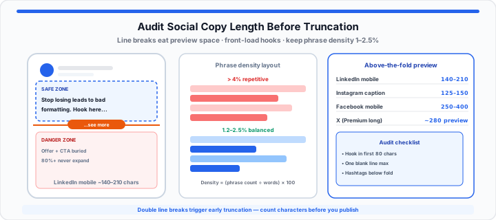
Spending forty-five minutes crafting an insightful social post only to watch its organic engagement flatline is a quiet nightmare for copywriters. When I review performance dips across client channels, the culprit is almost always structural rather than creative. A draft looks clean in a desktop text editor, but once published on a mobile feed, the critical value proposition and primary call-to-action get shoved behind a gray “...see more” button.
Think of mobile feed truncation like a physical storefront window display where a low-hanging awning blocks the product tags from passersby on the sidewalk. If your primary offer hangs behind the awning, pedestrians walk right past without ever stepping inside. In my experience auditing organic reach variations across B2B and consumer brands, if your top hook does not fit cleanly inside the open glass space of the mobile viewport, more than eighty percent of scrollers will never click to expand the rest of your text.
The Invisible Line: Understanding Mobile Feed Truncation
When drafting content for social channels, relying solely on standard character limits is a dangerous trap. A platform might allow 3,000 characters in a single upload, but its interface design forces a hard visual break long before you reach that ceiling. Mobile feeds do not truncate text based on character volume alone; they truncate based on vertical line height and viewport real estate.
In our platform formatting tests, carriage returns and line breaks pull forward the truncation point faster than raw letter counts. A short, five-word sentence followed by two empty line breaks takes up more vertical pixel space than three full-width sentences packed tightly together. As a result, the feed algorithm triggers an early truncation splice to preserve vertical screen space for the next post in the feed.
Character width variations also distort your layout calculations. Capital letters, wide characters like “W” or “M”, and complex emojis consume more horizontal inline space than narrow characters like “i” or “l”. Furthermore, modern emojis utilize UTF-16 surrogate pairs, meaning a single multi-tone emoji can count as two to four standard character units in backend database logic while eating up a massive block of visual inline space. Paste drafts into the LinkedIn Character Counter to watch the see-more preview row alongside the full post cap, or use the multi-platform Character Counter for Instagram, X, SMS, and YouTube title limits in one pass.
Step-by-Step: How to Measure and Structure High-Converting Copy Weight
To get started building a reliable copy auditing routine, stop treating your draft as a continuous block of narrative prose. Instead, break your text into distinct functional zones based on visual weight and line distribution.
- Front-load the core premise in sentence one: Place your primary outcome or controversial observation within the first 80 characters. Do not spend warm-up sentences setting background context.
- Restrict vertical carriage returns: Keep line breaks to a single empty line spacing block. Inserting double or triple empty carriage returns forces mobile application wrappers to truncate copy after as few as two lines.
- Audit character counts against device viewports: Calculate total string length against the specific mobile viewport target. Ensure your main hook remains under 140 characters if you want three clean lines displayed across all device sizes.
- Calculate phrase repetition: Identify overused brand buzzwords or technical terms. Over-indexing on the same phrase bloats your word count without adding fresh context, increasing the overall weight of the post while lowering reader interest.
- Position secondary links and hashtags safely: Place all secondary tags, outbound website links, and administrative hashtags deep inside the lower body text, far past the above-the-fold cutoff zone.
Normalize shouty ALL CAPS hooks with the Case Converter before counting, and hear pacing issues early with the Text to Speech tool from our accessibility readability audit guide.
The Ultimate Social Media Character Bench Sheet
Moving onto channel-specific rules, refer to this desktop and mobile bench sheet when auditing your draft parameters before publishing:
| Platform & Viewport | Raw Ceiling | Above-the-Fold Limit | Line Break Cutoff | Hook Strategy |
|---|---|---|---|---|
| LinkedIn Mobile App | 3,000 characters | 140 – 210 characters | 3 visible lines | Punchy statement, single empty return |
| LinkedIn Desktop Feed | 3,000 characters | 210 – 280 characters | 5 visible lines | Clear benefit claim, sub-headline style |
| X (Standard Account) | 280 characters | 280 characters (full) | No truncation | Zero fluff, high word variation |
| X (Premium Long-Form) | 25,000 characters | 280 characters | 4 visible lines | Lead like a magazine headline |
| Instagram Feed Caption | 2,200 characters | 125 – 150 characters | 2 visible lines | Front-load keywords before first break |
| Facebook Mobile Feed | 63,206 characters | 250 – 400 characters | 4 visible lines | Direct question or bold contrast |
Eliminating Robotic Overuse with Density Auditing
In practical environments, length is only half of the performance equation. The other half is structural word density. When writers attempt to optimize copy for search engines or internal brand guidelines, they often fall into keyword stuffing or corporate jargon loops.
Repeating buzzwords like “synergy,” “scalable,” or specific product names every few sentences creates an unnatural, robotic reading experience. Algorithmic feed filters assess semantic variety. If your draft over-indexes on repetitive phrases, distribution logic can flag the post as low-quality promotional spam.
Mathematical density analysis is calculated using a straightforward ratio: Phrase Density % = (Target Phrase Count / Total Word Count) × 100.
Maintaining a healthy phrase density range between 1.0% and 2.5% keeps content natural and readable. Anything above 4.0% indicates heavy repetition that disengages human readers and risks algorithm suppression. For blog and landing-page keyword audits, pair this workflow with our overused keyword SEO audit guide and run frequency checks in the Character Counter.
Instead of manually counting characters on your fingers or guessing if your core keywords sound repetitive before hitting publish, you can drop your raw draft into our interactive Character Counter and LinkedIn Character Counter to map out your feed layout instantly. A pre-publish audit ensures your message lands cleanly, captures user attention immediately, and stays safely above the fold on every screen size.
Pre-publish routine: Paste into the LinkedIn Character Counter, confirm the see-more row stays green under 210 characters, then scan word-frequency output in the Character Counter before scheduling.
Open LinkedIn Character Counter Open Character Counter
Frequently Asked Questions
What exactly is the “above-the-fold” limit for a standard LinkedIn post on mobile?
On mobile devices, LinkedIn typically displays the first 140 to 210 characters or the first three lines of text before inserting the “...see more” truncation link. If your copy uses extra line breaks, the platform may truncate your post after as few as two lines regardless of total character count.
Do emojis count as single or multiple characters when calculating social copy length?
While emojis appear as a single visual symbol on screen, most underlying social media systems process them using UTF-16 surrogate pairs. This means standard emojis count as two characters, while emojis with custom skin tone modifiers or gender options can consume up to four or seven character units in backend character calculations.
How does high phrase density negatively impact organic content distribution algorithms?
High phrase density occurs when a piece of copy repeats the exact same keyword or buzzword excessively. Social media ranking algorithms monitor text for low-value promotional patterns. When keyword density exceeds roughly 4%, automated distribution systems may classify the content as commercial spam, reducing its organic feed reach.
Why does carriage return spacing trigger early post truncation on mobile devices?
Mobile app feed interfaces are designed to maximize vertical screen efficiency. When a post contains multiple consecutive carriage returns or blank lines, the interface layout engine triggers an early visual break to prevent a single user’s post from monopolizing the screen viewport.