
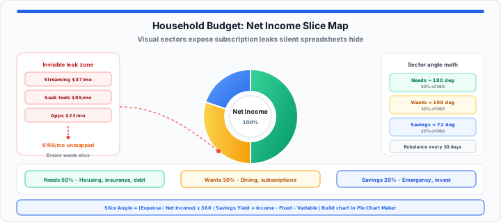
The Invisible Subscription Drain
You stare at your empty bank account at year end. Your hard-earned cash savings disappeared without warning. Minor recurring subscription streaming fees silently drained your cash flow. Small unmonitored software costs bloated your variable monthly overhead margins. In my financial advisory experience, raw bank statements hide leaks. Rows of numbers in spreadsheets fail to trigger behavioral change.
Think of your household budget as a circular boundary map. It is a closed capital pool built to enforce targets. Imagine your monthly net income as a fresh pizza pie. Fixed bills take several large primary slices right away. A specific slice remains for lifestyle and flexible spending choices. Without visual mapping, you blindly eat into your savings margin. You realize the entire box is empty far too late.
Visualizing cash distributions prevents sudden cash flow panics. Let us analyze proportional expense management across three financial diagnostic frameworks.
Instant Budget Snapshot: Enter your take-home pay and expense categories in our Budget Calculator, then map the proportions visually with the Pie Chart Maker.
The Proportional Slice Constant
To get started, evaluate total net take-home household pay first. Confirm your baseline with the Take-Home Paycheck Calculator if you only know gross salary figures. Essential expense buckets require strict geometric proportional slices. Fixed costs include housing payments, insurance, utilities, and debt minimums.
In our budget testing, visual clarity reduces household impulse spending. Unmapped income leads to unchecked lifestyle creep and financial stress. Visual sector angles reveal overfunded categories instantly on screen.
Category Slice Angle = (Expense Value ÷ Total Net Income) × 360
Savings Yield = Income − Fixed Costs − Variable Drifts
You can simulate budget distributions with our Pie Chart Maker online. Cross-check percentage splits on the Percentage Calculator when you adjust category targets. Proportional allocation matrices ensure balanced long-term wealth accumulation goals. Review our structured household budget framework comparison reference guide below.
| Budget Framework | Time to Spot Expense Bleed | Success at Funding Savings Milestones | Simplicity for Beginners |
|---|---|---|---|
| 50/30/20 Allocation Rule | Instant (Clear Visual Sectors) | High (Guaranteed 20% Slice) | Very High (Simple Categories) |
| Zero-Based Budgeting Method | Medium (Requires Manual Audits) | Very High (Every Dollar Assigned) | Low (Time Intensive Setup) |
| Raw Cash Envelope System | Fast (Physical Cash Limit) | Low (Lacks Growth Tracking) | Medium (Requires Manual Handling) |
The Fixed Overgrowth Variable
Moving onto expense dynamics, fixed cost creep chokes savings capacity. When I review client expense allocations, isolated numbers mask problems. Unmapped housing costs and utility spikes compress discretionary spending buffers. Tracking expense items in text columns fails to inspire action. Visualizing slice expansion forces immediate household capital adjustments. You must isolate variables that cause severe monthly financial strain.
Map out your cash flow using our Pie Chart Maker today. Test custom savings milestones in the Savings Calculator and confirm debt targets on the Debt Payoff Calculator.
Discretionary Spending Limits
Unplanned dining out and shopping expenses erode core emergency reserves. Setting strict visual slice boundaries caps flexible lifestyle spending limits. Sector visual constraints keep non-essential purchases well under control. Monitoring discretionary percentage limits protects monthly wealth generation goals. Smaller lifestyle slices preserve vital capital for long-term investments.
Dynamic Savings Percentages
Automated savings contributions should represent an inviolable visual sector. Pay yourself first by reserving capital before paying bills. Increasing savings percentages shrinks discretionary spending sectors automatically. Visualizing growing savings slices builds strong long-term financial motivation. Consistent percentage allocations secure family emergency funds rapidly.
Variable Utility Thresholds
Seasonal heating and electricity surges alter fixed monthly overhead balances. Budgeting buffer sectors absorb unexpected energy bill spikes smoothly. Tracking variable utility drifts prevents surprise checking account overdrafts. Visualizing annual utility averages stabilizes monthly cash flow expectations. Proactive allocation adjustments protect baseline household wealth reserves.
The Production Milestone Tracking Log
In practical environments, household managers update monthly visual charts regularly. Updating visual sectors pinpoints utility surges before reserves disappear. Seasonal insurance premiums and tax bills disrupt cash balances. Visual tracking isolates exact moments when costs threaten runway goals. Dynamic visual feedback keeps family financial decisions completely aligned.
Comparing monthly sector changes exposes creeping subscription expense trends. Visual sector analysis secures long-term household wealth building foundations. Review these core financial parameters for visual budget tracking:
- Maximum Essential Expense Allocation: Cap fixed costs at 50 percent.
- Target Discretionary Category Threshold: Limit lifestyle spending to 30 percent.
- Minimum Emergency Fund Contribution Rate: Maintain 20 percent baseline savings.
- Chart Update Frequency Standard: Rebalance visual sectors every 30 days.
- Debt Service Sector Ratio: Keep debt payments under 15 percent — model yours on the Debt-to-Income Ratio Calculator.
- Capital Cushion Buffer Allocation: Reserve 5 percent for unexpected fees.
- Annual Insurance Premium Sinking Sector: Allocate monthly fractional funds.
- Investment Growth Target Sector: Expand wealth holdings consistently each month via the Compound Interest Calculator.
Build Your Household Pie Chart Run Budget Calculator
Use our Pie Chart Maker to build your household chart. Visualizing cash allocations converts confusing statements into clear actions. Take control of your household finances with visual budget mapping.
Frequently Asked Questions
- How do I make a clean budget pie chart?
- Gather your total net income and monthly expense totals. Group expenses into needs, wants, and savings categories. Enter your category values into an online chart tool. Download your visual breakdown to guide monthly spending decisions.
- Why use an online chart maker instead of spreadsheets?
- Spreadsheets present dense rows of numbers that obscure leaks. Visual chart makers instantly show proportional category sizes clearly. You spot bloated spending sectors within seconds of entry. Visual charts drive faster behavioral changes than raw data tables.
- What is the 50/30/20 budget allocation rule?
- The rule divides net take-home pay into three buckets. Allocate 50 percent of income to essential living needs. Reserve 30 percent for discretionary personal lifestyle choices. Direct 20 percent into savings and debt payoff targets.
- How often should you update your visual budget breakdown?
- Update your budget chart at the start of each month. Recalculate category totals when income or fixed bills change. Track monthly sector shifts to catch creeping expense leaks early.